Incentives 6 block design & features
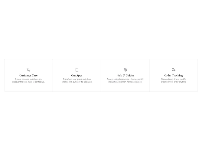
The Incentives6 component provides a visual and interactive way to present key offerings or features through a carousel interface. It beautifully displays a set of incentives, each represented by an icon, title, and descriptive text. Users can navigate through these incentives using carousel controls, making it an engaging way to highlight important information. The component is designed with a modern aesthetic, ensuring that the information is not only informative but also visually appealing.
Delving deeper, the Incentives6 leverages a carousel layout system, allowing for seamless integration of different incentives, which are dynamically rendered. It incorporates the shadcn ui's carousel structure, offering harmonious transitions and a clean arrangement of incentive items. Each item in the carousel is encapsulated within a shadcn block, displaying a central icon, a prominently styled title, and a descriptive segment. This design choice ensures clarity and focus on the content being presented. The component's layout adapts to different display sizes, utilizing a grid format for screens above a specified width. This shadcn component effectively merges functionality with flexibility, setting it apart in terms of user engagement and content presentation.