Incentives 2 block design & features
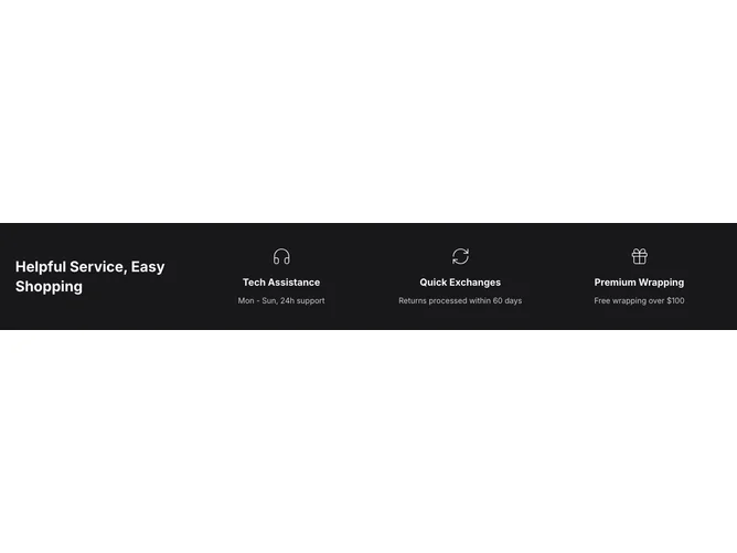
This component renders a visually engaging incentives section with a unique shadcn ui element, featuring a carousel layout to display multiple incentives through a clean and structured design. It offers users an accessible way to showcase a series of services or benefits in a compact format, using defined icons and text to communicate each incentive effectively.
The shadcn block stands out with its visually appealing and functional carousel that supports smooth navigation across incentive items. The default layout positions the main title and incentives in a grid, adapting seamlessly to different screen sizes. By employing an assortment of icons and concise descriptions, it allows for clear differentiation between multiple incentives, enhancing user interaction. The configuration offers flexibility with customizable classes, enabling users to extend and integrate seamlessly within different contexts while maintaining aesthetic coherence.