Feature 71 block design & features
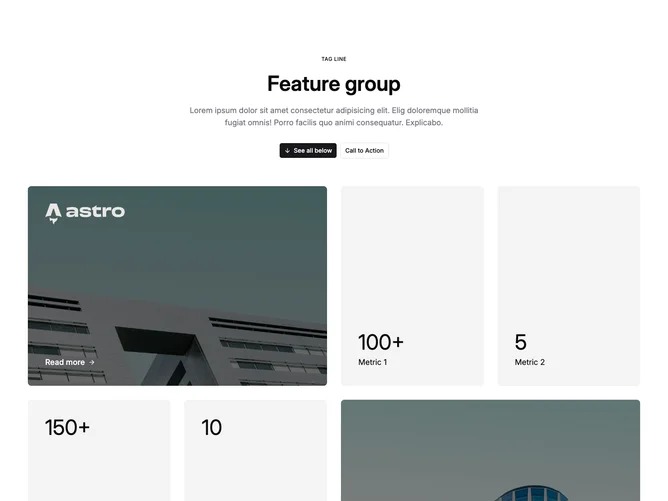
Feature71 anchors the page vertically with headline copy and dual call-to-actions from shadcn/ui buttons before unveiling a heterogeneous grid that blends photography overlays, monochrome brand marks, statistic slabs, and follow-on links indicated by directional arrows. The grid spans two columns early then graduates to quartered columns on roomy screens while individual cells span multiples of tracks for hero-like panels.
Muted accent tiles cradle giant numerals labeling metrics, juxtaposed against darker photographic cells whose overlays deepen slightly on hover. Typography toggles uppercase micro labels for the prelude, restrained semibold body on buttons, oversized numerals embedded in rectangles, and small white link treatments riding image surfaces. Rhythm alternates heavyweight photography with quieter stat blocks creating a stitched dashboard mood.
Sophisticated bento choreography suited to metrics plus storytelling mixtures. Complexity is moderately high owing to asymmetric spans and intertwined assets: expect large photography, credible statistics, coherent logo marks, meaningful link labels, plus button intents. Personality reads confident and collage-like versus pure icon grids.
Intermediate breakpoints remap how many spans each tile occupies so mid-width readers still perceive grid texture without cramming miniature photography.