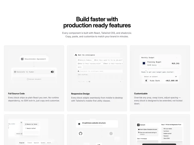

Feature 63 block design & features
Feature63 opens with centered Shadcn UI typography: a large balanced heading and optional muted intro paragraph constrained in width. Below, a grid renders up to six feature cards using Shadcn UI surface styling. Each card stacks a four-by-three cropped image with top anchoring, then a small bold title and supporting paragraph on an accent-filled, bordered panel with comfortable padding.
The system reads as a catalog or capability matrix: repeated card chrome makes scanning predictable, while imagery above text keeps the grid from feeling like a bare list. Density is medium; spacing between cards stays uniform across breakpoints.
It is a moderate-complexity block whose workload is content-heavy: six titles, six blurbs, and six distinct images pay off far better than duplicate placeholders. Trend-wise it aligns with current marketing grids that pair photography with succinct labels.
Responsiveness moves from one column on phones to two on medium screens and three on large ones, so cards reflow without cramming while the header remains centered above the grid.