Feature 59 block design & features
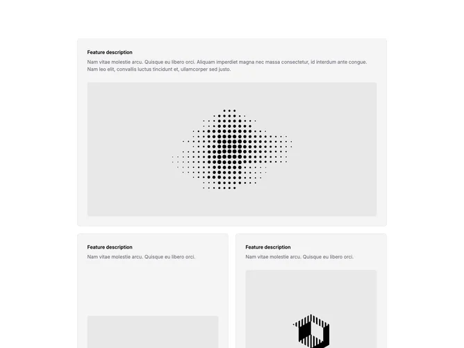
Feature59 mirrors the card language of similar bento blocks and is built with shadcn/ui spacing and border utilities. A wide top panel spans both grid columns with accent background, hairline border, bold label, paragraph, and a large wide image. Under that, the grid places one tall card in the first column spanning two rows beside two shorter cards stacked in the second column on large screens, each repeating the small label, muted text, and image pattern.
Rounded corners, accent fills, and consistent typography create a soft product-marketing look without gradients or heavy shadow. Images anchor toward the bottom of each card on desktop so text leads and visuals settle underneath.
Compared with simpler three-up grids, this layout’s asymmetry (wide hero plus tall flank) feels more editorial and slightly higher effort. You need several distinct images and concise blurbs to avoid repetition.
At smaller breakpoints the mosaic stacks in source order; the tall card no longer spans multiple rows, so the story reads as sequential cards rather than a rigid bento shell.