Shadcn UI Feature Block
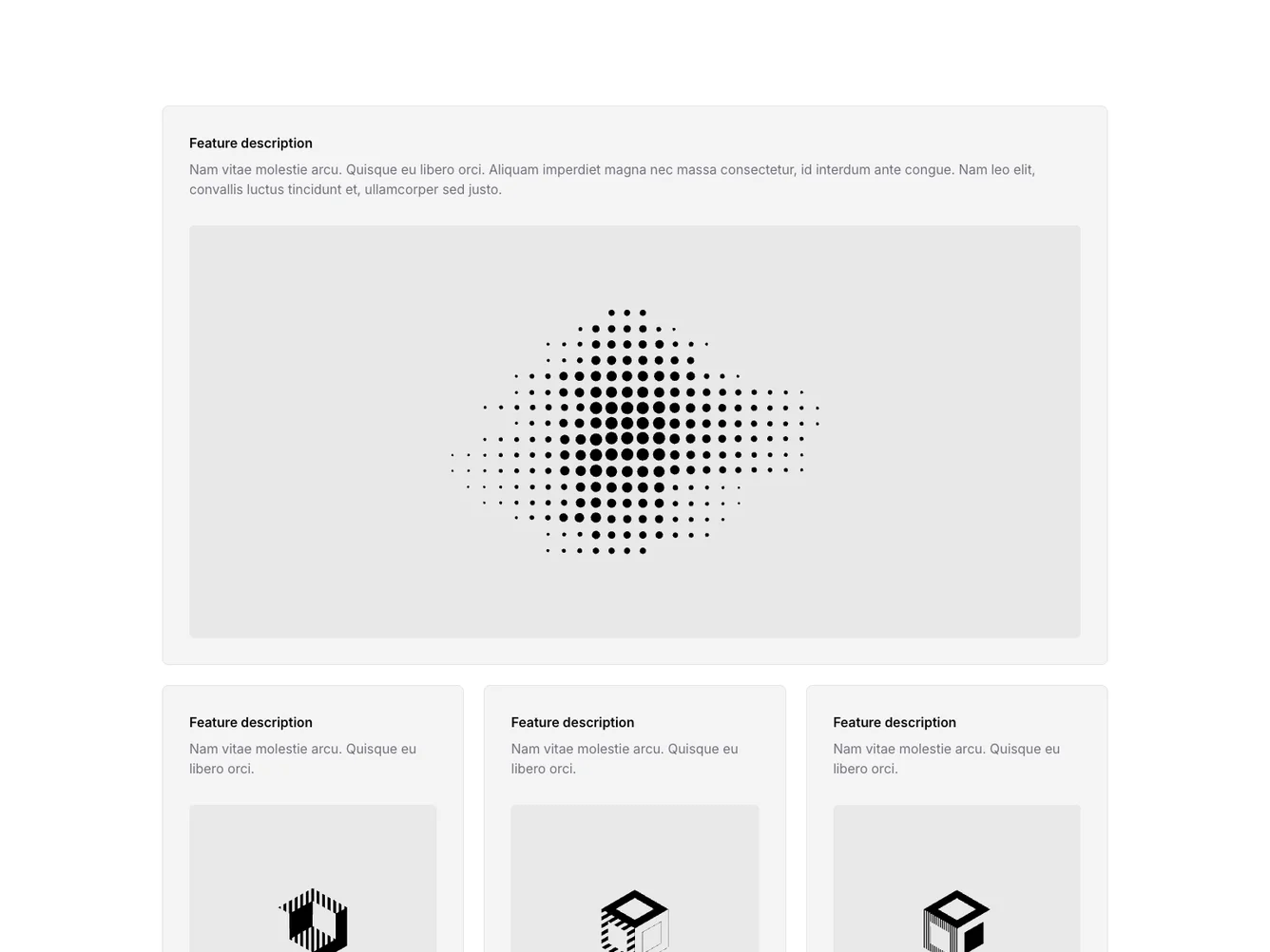
The Feature56 component is a structured layout designed to effectively present multiple feature highlights in a clean and visually appealing manner. It consists of a main section featuring a standout description and image, followed by a grid displaying three additional feature cards. Each card provides a brief description, supported by an illustrative image, making it ideal for showcasing key product features or services.
Diving deeper, the Feature56 component makes use of a shadcn block style to achieve a minimalist and balanced design. The main feature section uses a 'bg-accent' background, creating a focal point for users. Each feature card in the grid layout comes with adaptable spacing, ensuring that the content remains well-ordered across varying screen sizes. The use of consistent typography and strategically placed images assists in maintaining user engagement and effectively communicates essential information.
