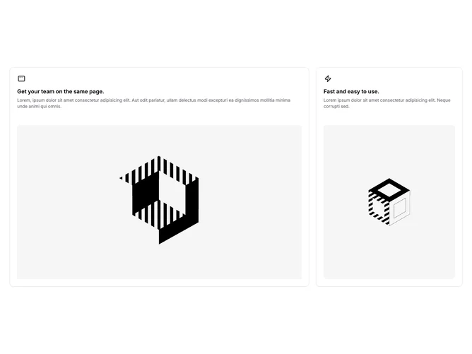
Feature 5 block design & features
This block built with shadcn/ui arranges exactly two feature stories in a responsive grid that grows to three columns on large screens. The first story spans two columns and stacks text above a wide square-topped image inside a Card; the second occupies the remaining column with the same text-then-image rhythm but a taller, narrower image treatment. Small outline icons sit above each title as quick visual anchors.
Both cards use standard bordered surfaces, left-aligned type, and muted paragraphs under semibold headings. Images receive rounded upper corners so the photo areas feel inset rather than edge-to-edge. The wider card reads as the primary story and the side card as a supporting highlight. Hover motion sticks to defaults from interactive elements if you add links later.
The layout reads as a small bento pair: asymmetric emphasis without a full mosaic. It is more distinctive than equal-width feature columns because of the two-column span, yet still easy to author with two headline-and-image pairs. Complexity is moderate and mostly content-driven: you need strong photography or illustrations for both slots.
On medium widths the grid becomes two equal columns before upgrading to the wide-plus-narrow pair when the three-column track activates.