Feature 39 block design & features
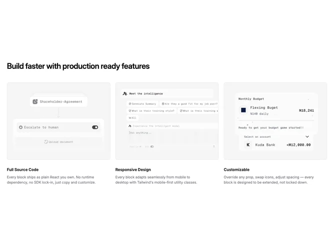
Feature39 is a three-column feature section built with shadcn/ui, containing a left-aligned heading and a grid of three cards below. Each card has a landscape image with rounded corners and a thin border, followed by a bold title and a short description. The images are cropped to a 4:3 aspect ratio.
Light background with dark text throughout. The cards are borderless below the image, with no card wrapper or shadow, giving the layout an open, editorial feel. Spacing between cards is uniform and generous. Typography is headline-forward with a large semibold heading and smaller semibold card titles. No hover effects or animations.
A straightforward, minimal layout that sits close to a default shadcn wireframe style. The lack of card borders, backgrounds, or interactive elements keeps it simple and content-focused. This is a low-complexity block where the images do most of the visual work. To use it effectively, you would need three landscape images and short copy for each card.
On smaller screens the grid collapses from three columns to two, then to a single stacked column on mobile.