Feature 36 block design & features
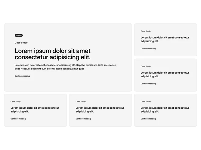
This block is a card-based case study grid built with shadcn/ui. A single wide card spans more horizontal space than the others and reads as the primary story, while five compact cards sit in the surrounding grid. Each card carries a title, short supporting text, and a text link to read more. The lead card can show a small badge-style label above the title to mark it as featured or a category.
Light surfaces and clear typographic scale separate headlines from body lines. Cards pick up a stronger outline on hover so the whole tile feels clickable, not just the link. Spacing is generous so the grid reads as a set of distinct stories rather than a dense table.
The pattern is a familiar marketing case study wall with one hero tile and a cluster of supporting entries, useful when you have one flagship story and several shorter ones. Complexity is moderate: you need real titles, blurbs, and destinations for each card, plus optional badge copy for the lead.
On narrow viewports the grid stacks into a single column so each card gets full width and the featured card still appears first in document order.