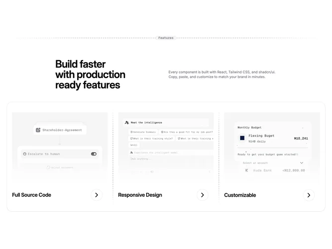
Feature 342 block design & features
Feature342 is a features section with a centered dashed line at the top containing a monospace tagline, followed by a two-column header with headline and description, and a large card containing three feature items arranged horizontally. Each feature item has an image with a gradient fade overlay, a bold title, and a circular chevron button that animates on hover. Vertical dashed lines separate the feature items on desktop.
The visual treatment is minimal with a muted color palette. The dashed line with centered text creates a distinctive section opener. The card has generous rounded corners (rounded-3xl) and no padding on the CardContent to allow the feature items to control their own spacing. Images have a bottom-to-top gradient fade that blends into the card background. The chevron buttons have a subtle border and translate animation on hover.
This exemplifies the mainline design system with its signature dashed line decorative elements and restrained styling. The three-column card layout provides a clean way to showcase product features or capabilities. The combination of images and text creates visual interest without overwhelming the minimal aesthetic.
On mobile, the feature items stack vertically with horizontal dashed lines between them instead of vertical. The tagline in the dashed line header is hidden on smaller screens to maintain clean proportions.