Feature 3 block design & features
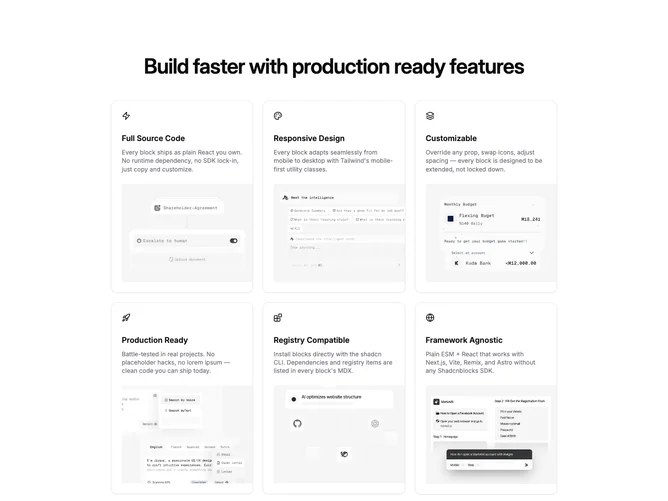
Feature3 is a card grid built with shadcn/ui Card pieces. Each tile stacks three regions: a header row with an icon, a central block with title and paragraph, and a footer that holds an image. The section can repeat that pattern across up to six cards while keeping rim spacing even so the scan line moves down the grid in predictable steps.
Tone-wise this stays close to vanilla shadcn defaults: neutrals, modest radius, centered text inside each card, and imagery that occupies a fixed footer band. Nothing relies on gradients or illustration overlays. Shadows and borders stay light, which keeps the block easy to adapt to strict design systems.
This is a straightforward, high-utility pattern rather than a novel layout. Uniqueness is low, but clarity is high for product feature lists or service breakdowns where each point needs a small visual anchor. Content demand scales with how many cards you enable: every slot needs a short headline, supporting sentence, meaningful icon choice, and a crop-friendly image.
The grid collapses from three columns toward one as the viewport narrows so mobile readers encounter one coherent card stack instead of cramped multi-column slices.