

Feature 27 block design & features
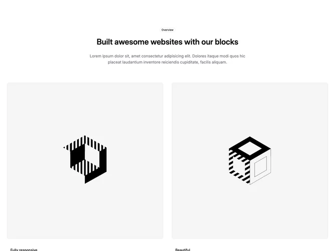
Feature27 is a simple overview section built with a Shadcn UI outline badge and a responsive image grid. The top block is narrow and centered: badge, display heading, and supporting paragraph. Below, two equal columns each show a rounded bordered image, then a subheading and paragraph with horizontal padding; a third row spans both columns with a wide aspect-ratio image and its own caption block.
Surfaces stay light with standard borders on imagery and muted body copy under each title. Spacing is generous between the intro cluster and the grid, and again between grid rows, so the layout reads as editorial rather than dense. There is no motion or interactive chrome beyond default links if you add them in content.
This is a straightforward, shadcn-default leaning pattern: good for highlighting three related points with photography or diagrams. It is intentionally simple, so differentiation comes from your images and captions rather than effects. You need three visuals and paired titles plus short explanations.
On medium screens and up the two-up row sits side by side; the final row always spans the full width of the container. On the smallest screens the pairs stack vertically in order.