Feature 20 block design & features
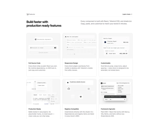
Feature20 is a catalog-style feature section built with shadcn/ui. A top band presents the section title and a small text link such as “Learn more,” then a short introductory area can span two text columns before the main card grid. Each card pairs a thumbnail or icon image with a utility name and description so the section reads like a directory of integrations or tools.
Cards share one visual language: uniform corner radius, consistent padding, and subdued borders or shadows. Separators may appear between header and body or between grid rows to keep scanning orderly. Hover states are mild, mainly lifting contrast or border emphasis rather than large motion.
Complexity is moderate because of volume: you fill a header, optional intro sentences, and a set of parallel card objects with imagery. The design is familiar SaaS marketing, optimized for breadth rather than a single story.
The card grid reflows from several columns on wide screens down to one or two on handheld widths while keeping each tile readable without sideways scrolling.