Feature 174 block design & features
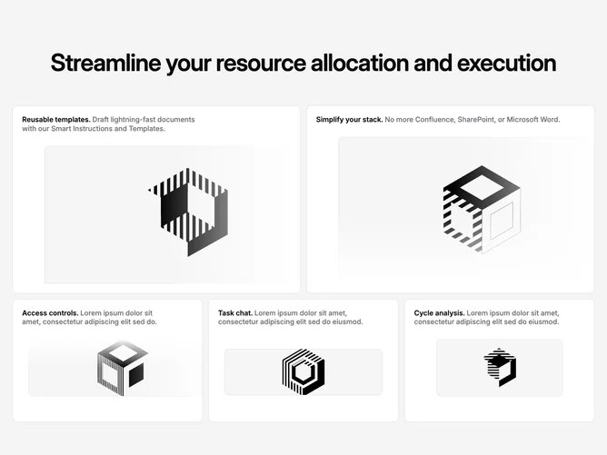
Feature174 is a full-width feature bento built with shadcn/ui Card primitives. A centered multi-line headline sits on a muted page background. Under it, five tiles arrange into an asymmetric grid on medium and up: two tall hero-like cells on the first row, then a band of three shorter cells aligned along the bottom row. Every tile shares the same content pattern: the title and description run inline in the header, and a single rounded screenshot-style image fills the lower body with controlled overflow.
Light gray field behind the section, borderless cards, and shadow-free panels keep the grid feeling flat and editorial. Several cells layer directional gradient veils over the imagery so screenshots appear to dissolve into the background along the right, bottom, or top edge depending on the tile. Images also receive slight horizontal nudges at wider widths, which adds depth without hard drop shadows. No animation is present.
This reads as a polished product marketing layout with a dashboard-style density of ideas. The bento arrangement is the distinctive element compared with uniform card rows. Complexity is mixed: the CSS grid and fade masks do visual work, but you still need five coherent feature stories with matching imagery to sell the pattern. It is more elaborate than a simple three-up icon list.
On small screens the bento collapses to a single column with comfortable vertical gaps, so each feature reads as a full-width card before the asymmetric desktop mosaic returns.