
Feature 172 block design & features
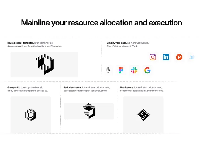
Feature172 is a structured marketing feature section built with shadcn/ui patterns. It opens with a large centered headline, then stacks a two-column row and a three-column row. Each cell pairs an inline heading with muted supporting copy, followed by imagery: either rounded screenshot-style assets with slight horizontal offset or a dense grid of small square logo tiles shown in staggered rows. Horizontal dashed separators span the stack, with vertical dashed dividers between columns on wider viewports.
The frame reads as editorial wirework: muted separator lines taper at the edges, hairline-feel typography, and soft rounded rectangles on thumbnails. Logo clusters sit on light neutral chips with gentle edge fades where content overflows. Gradient scrims appear on stacked mobile layouts where images would otherwise butt against screen edges.
This is an elaborate layout by marketing standards: diagonal emphasis comes from dashed guides and asymmetric image offsets rather than loud color blocks. Complexity is partly content-driven because each row mixes different asset types and counts. Replacing placeholders with real screenshots and coherent brand logos keeps the story legible without changing the scaffolding.
Below large breakpoints each column becomes a full-width band; separators flip to horizontal between stacked cells so the dashed rhythm survives on narrow screens.