Feature 127 block design & features
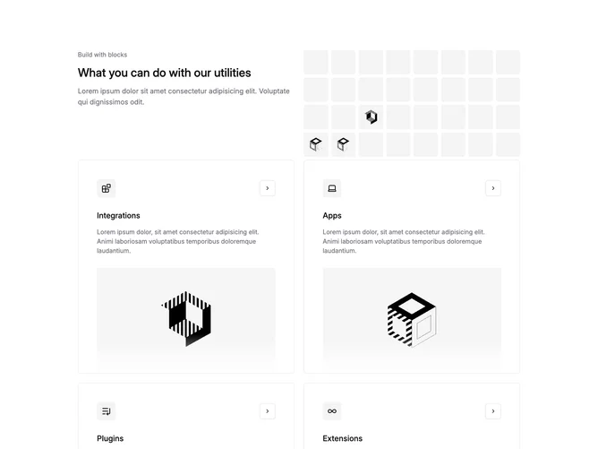
Feature127 opens with a section heading and supporting paragraph, then transitions into a bento-style mosaic built with shadcn/ui. Multiple tiles combine circular or boxed icons, short titles, explanatory sentences, and occasional miniature diagrams or screenshots. Some cells layer faded photography or texture behind the text so utilities read as a curated capability board rather than identical cards.
Tile widths vary with soft separation via shadows or hairline borders; accent hues punctuate individual cells against an overall calm base. Icons precede copy so scanning stays fast across uneven rows. Occasional buttons invite follow-through where a tile promises more detail.
The aesthetic lands current and slightly dashboard-inspired without literal charts in every cell. Asymmetry and mixed media make it busier than a uniform icon row, which suits pages that must name several parallel utilities at once. Expect elaborate layout planning with simple content inside each cell.
Tiles reflow to fewer columns on narrow breakpoints while keeping headline-to-grid hierarchy intact.