Feature 126 block design & features
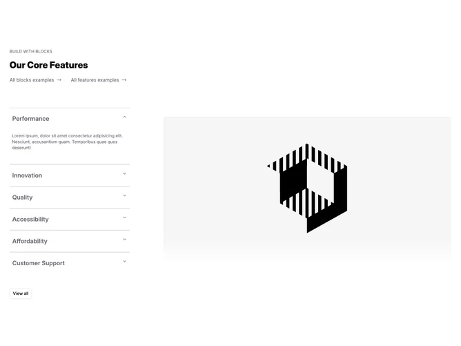
Feature126 is an interactive feature block built with Shadcn UI accordion patterns: collapsible rows with titles and paragraphs on one side and a prominent image region on the other. Expanding a row reveals fuller copy while the image area reflects the active topic so text and visual stay aligned.
Neutral surfaces with active-state emphasis on the open row through stronger labels or borders. Imagery sits large beside the list as photographic or illustrative placeholders. Motion comes from expanding and collapsing rows rather than from ornamental animation layered everywhere.
The accordion-plus-image pairing reads deliberate rather than decorative because interaction gates longer copy before it surfaces. Compared with a static grid it skews toward product-demo pacing. Complexity sits in the moderate range because copy, imagery, and expanded state need to stay coherent per panel.
On small screens the accordion and image usually stack so tapping still ties each narrative block to its paired visual when the implementation preserves that binding.