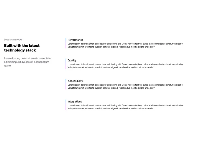
Feature 123 block design & features
Feature123 is a two-column layout built with shadcn/ui, with narrative copy on one side and a vertical stack of feature entries on the other. The intro column holds a section label, headline, short paragraph, and primary call to action. Each feature row on the opposite side combines a title with supporting text; a gradient bar runs vertically beside the list so the items read as one continuous timeline.
Light spacing with clear separation between the intro block and the feature column. Typography is headline-forward on the left and slightly denser in the list. The gradient reads as a spine rather than heavy ornament. The layout is static without relying on motion for hierarchy.
This sits in a modern marketing register with a recognizable silhouette thanks to the vertical accent rather than a plain bullet stack. The structure is a common pattern made specific by that spine and by balancing one editorial column against several concise rows. Complexity stays moderate: you need distinct feature titles and blurbs plus a coherent story in the lead column.
On narrow viewports the sections stack so the intro leads and the feature list follows in natural reading order.