Feature 112 block design & features
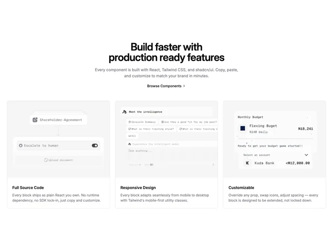
Feature112 centers its introduction then fans out into three equal cards built with shadcn/ui. The header stack optionally shows an outline badge, always shows a large balanced heading, may include muted supporting copy, and can include a simple chevron text link when the intro supplies one. The grid below maps up to three features: each card is a vertical column with a fixed aspect hero image, rounded top corners object-cover toward the top, and a padded body containing a semibold title plus muted paragraph text.
Visual rhythm depends on consistent card borders and spacing rather than colored backgrounds; imagery carries most of the character. Default placeholder language highlights source access, responsive layouts, and customization themes aligned with the broader catalog.
This pattern is a dependable marketing triplet: easy to scan, moderate complexity, content-driven. Swap SVG or raster art per card to shift mood without touching layout.
Three columns compress to one column on small screens while keeping image-first ordering inside each card.