Shadcn UI Feature Block
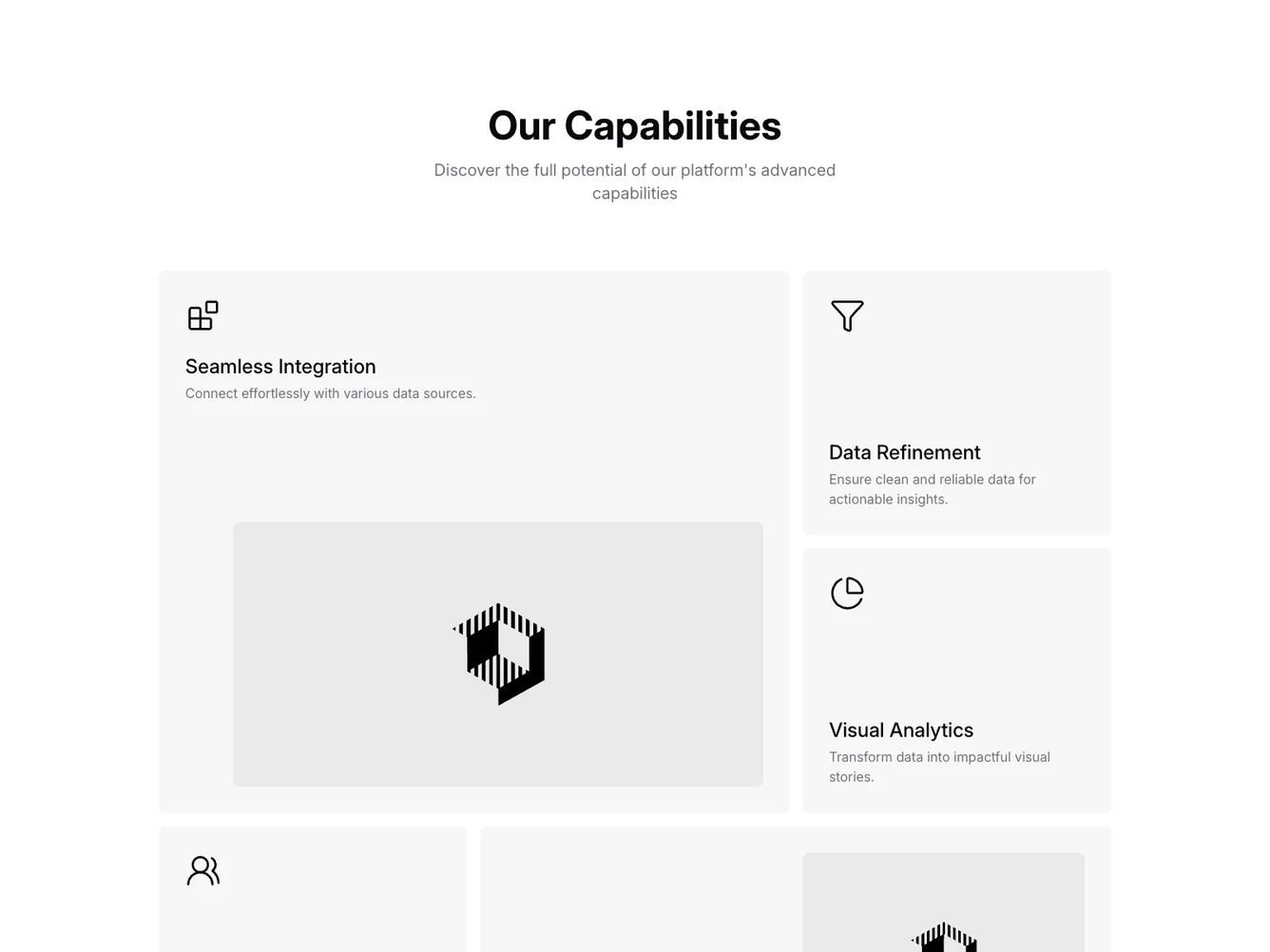
The Feature101 component serves as an informative and visually engaging section that highlights the unique capabilities offered by a platform. This component is designed to effectively showcase different features via a collection of feature blocks, making it an ideal choice for landing pages or product overview sections where quick visual assimilation is valuable.
Delving deeper, Feature101 is structured to include a central title and descriptive paragraph, ensuring that users understand the overarching purpose of the section. It makes use of a grid layout to flexibly arrange various feature cards, each focusing on a specific capability. The design incorporates recognizable icons coupled with concise descriptions to emphasize each aspect clearly. Additionally, the Shadcn block maintains a consistent style by using matched color themes and imagery, supporting transitions that add a layer of interactivity and engagement for users.
Dependencies
| Package | Type |
|---|---|
| lucide-react | NPM |
