Data Table 30 block design & features
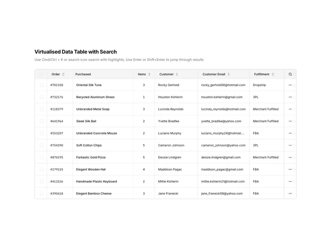
DataTable30 is a left-aligned section featuring a heading, descriptive text, and a virtualized data table with advanced search functionality. A search overlay highlights matching text within cells and provides navigation between results. The table includes sortable columns, row selection, and pinned columns for critical data.
Light background with dark text. The table has a thin border with rounded corners. Search matches are highlighted with a distinct background color within cell text. The search overlay shows result count and navigation arrows to jump between matches. Pinned columns remain visible during horizontal scroll. Loading and error states display appropriate visual indicators. Static layout with smooth virtual scroll and search interactions.
This is a data table designed for finding specific data within large datasets. The in-table search with highlighting makes locating specific values intuitive. The most distinctive feature is the search result highlighting with navigation, making it ideal for lookup-heavy workflows like customer service, inventory search, or audit reviews.