Data Table 21 block design & features
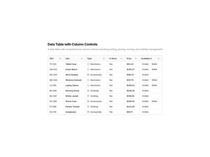
DataTable21 is a left-aligned section featuring a heading, descriptive text, and a data table with comprehensive column management. Each column header has a dropdown menu with options for sorting (ascending/descending), pinning (left/right), moving (left/right), and hiding. The table displays product inventory data with availability badges.
Light background with dark text. The table has a thin border with rounded corners. Column headers feature a dropdown trigger with a chevron icon. The dropdown menu contains grouped actions for sort, pin, move, and visibility. Pinned columns have a subtle visual distinction. Availability displays as secondary badges. Static layout with smooth menu transitions.
This is a data table designed for power users requiring full column control. The header dropdown menus consolidate all column operations in one place. The most distinctive feature is the comprehensive column management menu, making it suitable for complex data analysis where users frequently adjust table layout.