Data Table 20 block design & features
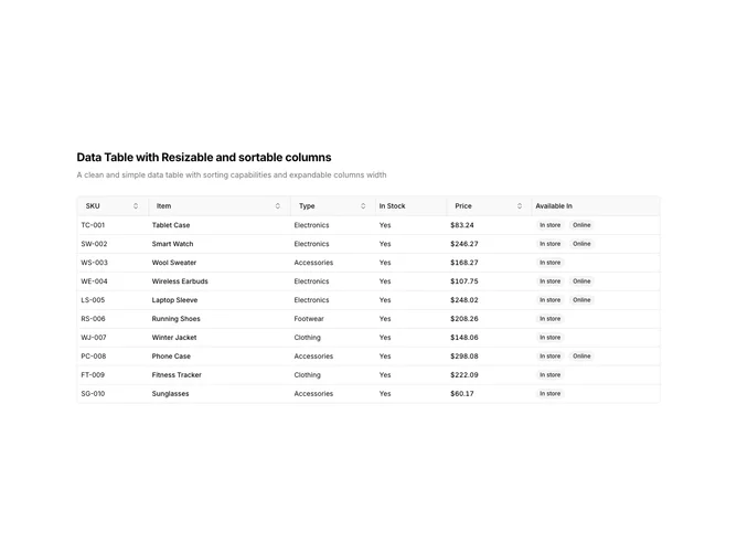
DataTable20 is a left-aligned section featuring a heading, descriptive text, and a data table with resizable columns. Each column has a drag handle on its right edge that allows users to adjust column width. The table displays product inventory data with sortable columns and availability badges.
Light background with dark text. The table has a thin border with rounded corners. Column resize handles appear as vertical lines between headers that change cursor on hover. Dragging the handle adjusts the column width in real-time. Column headers use ghost-style buttons for sorting. Availability displays as secondary badges. Static layout with smooth resize interactions.
This is a data table designed for customizable column widths. The resize handles allow users to allocate more space to columns with longer content. The most distinctive feature is the draggable column boundaries, making it suitable for datasets with variable content lengths where users need control over visible information.