Data Table 19 block design & features
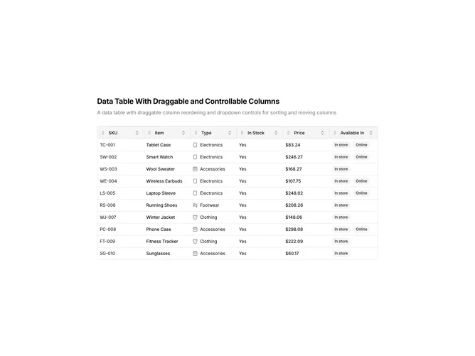
DataTable19 is a left-aligned section featuring a heading, descriptive text, and a data table with advanced column controls. Each column header has a dropdown menu providing options for sorting, hiding, and column management. Columns can also be reordered via drag-and-drop. The table displays product inventory data with availability badges.
Light background with dark text. The table has a thin border with rounded corners. Column headers feature a dropdown trigger that opens a menu with sort ascending, sort descending, and hide column options. Drag handles are integrated into the header for column reordering. Availability displays as secondary badges. Static layout with smooth interactions.
This is a data table combining column reordering with header dropdown menus. The dropdown menus provide quick access to column-specific actions without cluttering the interface. The most distinctive feature is the per-column menu system, making it suitable for power users who need fine-grained control over table presentation.