Data Table 18 block design & features
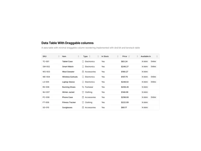
DataTable18 is a left-aligned section featuring a heading, descriptive text, and a data table with draggable columns. Column headers can be dragged horizontally to reorder the table layout. The table displays product inventory data with sortable columns and availability badges.
Light background with dark text. The table has a thin border with rounded corners. Column headers have drag handles that activate on hover. During drag operations, the column being moved has elevated styling with a visual placeholder. Column headers use ghost-style buttons for sorting. Availability displays as secondary badges. Static layout with smooth drag animations.
This is a data table designed for customizable column layouts. The drag-and-drop column reordering allows users to personalize their view by rearranging columns. The most distinctive feature is the horizontal column repositioning, making it suitable for dashboards or reports where users need control over data presentation.