Data Table 17 block design & features
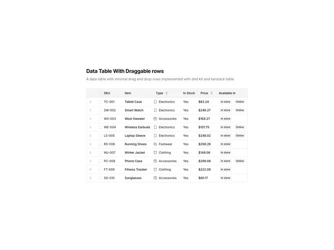
DataTable17 is a left-aligned section featuring a heading, descriptive text, and a data table with draggable rows. Each row has a grip handle in the first column for drag-and-drop reordering. The table displays product inventory data with sortable columns, row selection checkboxes, and availability badges.
Light background with dark text. The table has a thin border with rounded corners. Drag handles display as grip icons that change cursor on hover. During drag operations, the row being dragged has elevated styling. Column headers use ghost-style buttons for sorting. Availability displays as secondary badges. Static layout with smooth drag animations.
This is a data table designed for manual ordering of records. The drag-and-drop functionality allows users to reposition rows to establish custom sort orders. The most distinctive feature is the vertical row reordering with visual drag feedback, making it suitable for priority lists, playlist management, or any ordered dataset.