Data Table 16 block design & features
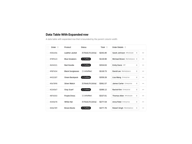
DataTable16 is a left-aligned section featuring a heading, descriptive text, and a data table with expandable rows. Each row has a chevron toggle that expands to reveal additional order details including shipping service, tracking number, warehouse, and assigned personnel. The table displays sortable columns with row selection and action menus.
Light background with dark text. The table has a thin border with rounded corners. Expanded rows display a detail panel with a muted background containing key-value pairs. Column headers use ghost-style buttons for sorting. Status values display as badges with icons. Each row has a three-dot menu for actions. Static layout with smooth expand/collapse transitions.
This is a data table designed for hierarchical data exploration. The expandable rows provide a master-detail pattern without navigating away from the table view. The most distinctive feature is the inline detail expansion, making it ideal for order management or any dataset requiring quick access to supplementary information.