Data Table 15 block design & features
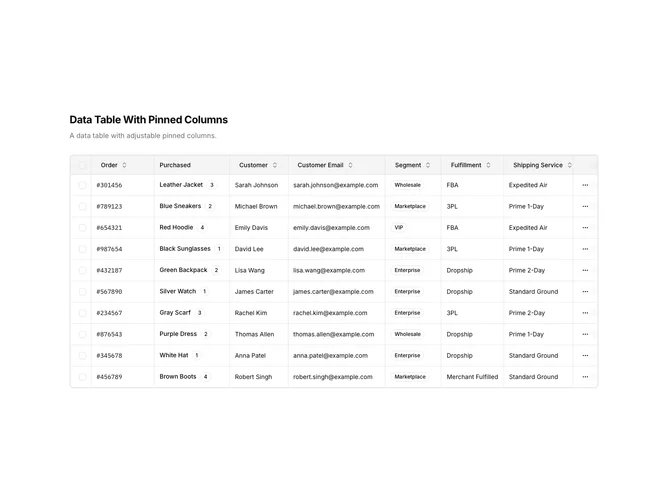
DataTable15 is a left-aligned section featuring a heading, descriptive text, and a data table with pinned columns. The select checkbox column is pinned to the left, while the actions column is pinned to the right, remaining visible during horizontal scrolling. The table displays order data with sortable columns and row action dropdown menus.
Light background with dark text. The table has a thin border with rounded corners. Pinned columns have a subtle background blur effect to distinguish them from scrollable content. Column headers use ghost-style buttons for sorting. Status values display as badges with icons. Each row has a three-dot menu for actions like copy ID, edit, and view details. Static layout with no entrance animations.
This is a data table optimized for wide datasets requiring horizontal scrolling. The pinned columns ensure critical data like selection and actions remain accessible. The most distinctive feature is the column pinning with visual separation, making it suitable for tables with many columns.