Data Table 14 block design & features
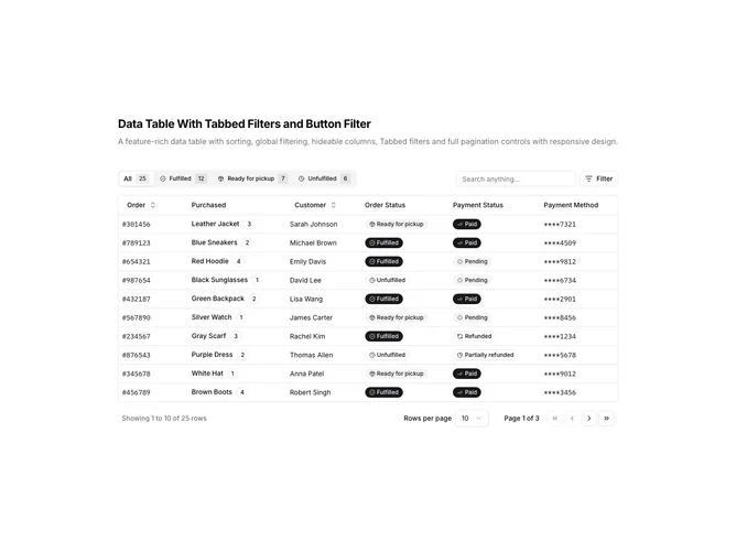
DataTable14 is a left-aligned section featuring a heading, descriptive text, and a data table with multiple filter controls. Above the table, a tabbed interface filters by order status with item counts, while a row of button filters handles payment status. A global search input allows filtering across all columns. The table displays sortable columns with full pagination controls below.
Light background with dark text. The table has a thin border with rounded corners. Tabs display status counts as badges. Button filters use outline styling and toggle active state. Column headers use ghost-style buttons for sorting. Status values display as badges with icons. Pagination includes page size selector, page jumps, and row count. Static layout with no entrance animations.
This is a feature-rich data table combining multiple filter paradigms. The combination of tabs for order status and buttons for payment status provides flexible data exploration. The most distinctive feature is the dual-filter approach, making it ideal for complex datasets requiring multiple filtering dimensions.