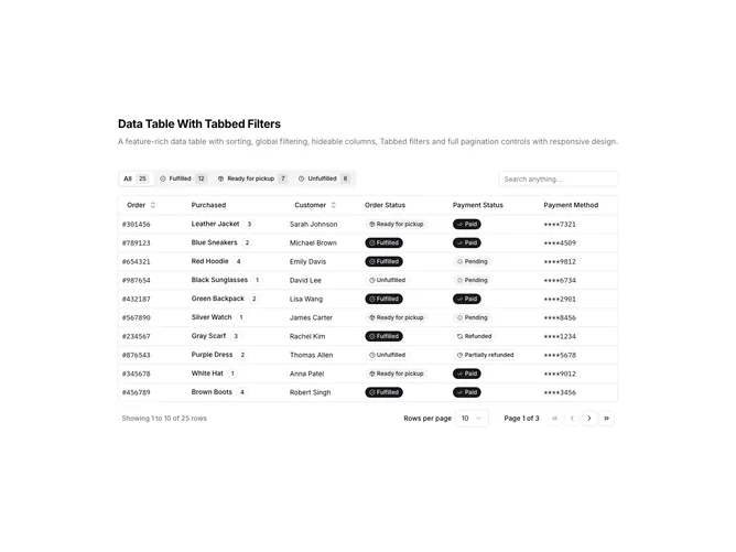
Data Table 13 block design & features
DataTable13 is a left-aligned section with a heading, description, a toolbar with tabbed filters and global search, and a full-width data table with pagination controls below. The toolbar features a horizontal tab bar for filtering by order status, with tabs for All, Fulfilled, Ready for pickup, and Unfulfilled. Each tab displays an icon and a badge showing the count of matching records. A search input sits to the right of the tabs. The table displays order data with columns for order ID, purchased item with quantity badge, customer name, order status badge, payment status badge, and payment method.
Light background with dark text. The table has a thin rounded border. The tab bar uses pill-style tabs with status icons and count badges. Clicking a tab instantly filters the table to show only matching rows. Status columns display badges with icons indicating order and payment states. Different badge variants distinguish status types. The pagination area includes row count, page size dropdown, page indicator, and navigation buttons. Static layout with no entrance animations.
This is a data table with tabbed filtering as an alternative to dropdown or popover filters. The tab pattern works well when there are few filter options and users frequently switch between them. Showing counts on each tab provides instant visibility into data distribution without opening a filter menu.