Contact 6 block design & features
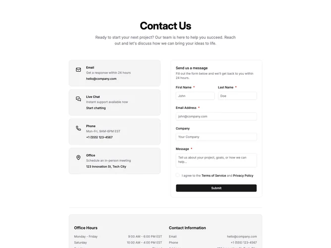
Contact6 opens with a centered hero-style title and paragraph, then splits into two columns on large screens within a layout built from shadcn/ui cards and fields: a vertical list of muted cards for email, live chat, phone, and office, each with icon, short description, and primary link, opposite a second card that houses the message form with first and last name on a shared row, email, optional company, message, required terms links, and full-width submit with loading feedback. A separator introduces a lower muted panel that pairs office hour rows with a contact information column so schedules and coordinates stay together.
Surfaces lean on borderless muted cards and simple icon wells rather than heavy shadows, while alerts mirror the green success treatment used across other blocks.
The block reads as operational and support-oriented because it surfaces multiple contact paths plus legal consent and scheduling facts in one scroll.
Hours and contact lines use small typography with justified label and value pairs for quick scanning.