Contact 5 block design & features
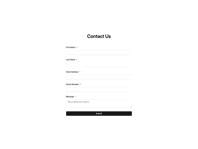
Contact5 is a compact form-only block built with Shadcn UI field primitives, centered inside a standard container with section padding. A single prominent heading sits above required inputs for first name, last name, email, phone, and message, followed by a full-width submit that swaps to a spinner label while posting. A green confirmation banner can appear above the stack after success, and root errors display in destructive text when submission fails.
Surfaces stay plain with no imagery or secondary columns, and required markers use asterisks on labels while inputs keep default light chrome.
The block stays intentionally basic and close to starter styling, with low visual complexity and no secondary marketing chrome.
There is no supporting paragraph beneath the title beyond the field list itself, so content stays tightly focused on completion.