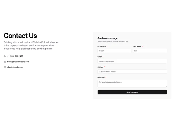
Contact 2 block design & features
Contact2 is a two-column contact pattern built with shadcn/ui: storytelling and paths on the left, capture on the right. The left stack pairs a strong headline with supporting copy and three compact links for phone, email, and site, each with a glyph. The right stack hosts first name, last name, email, subject, and message inside a rounded panel on a muted wash.
Submitting runs validation once send is pressed, marks required rows with asterisks, swaps the button into a loading state while the request finishes, surfaces a short success confirmation, then clears inputs so another note can follow. Inline errors stay calm until that submit attempt.
Visual treatment stays light and airy with wide gutters, tiny icons, link underlines on hover, bright inputs over the tinted tray, and defaults that sit close to stock shadcn styling rather than heavy chrome.
The grid collapses to a single column on small screens so contact shortcuts precede the form stack without reordering fields.