Contact 16 block design & features
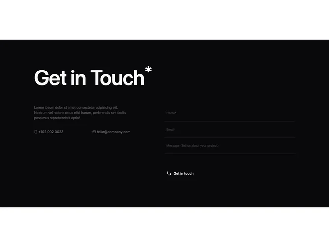
Contact16 is a dark, two-column contact strip built with shadcn/ui. The left column pairs an oversized headline marked with a small superscript asterisk, muted body copy, and phone and email rows with tiny glyphs. The right column holds name, email, and message fields drawn as underline strips plus a ghost submit with a corner arrow.
The canvas stays deep with light type so contrast stays high. Headline weight dominates the grid. Inputs drop visible boxes in favor of hairline bottoms, placeholders fade back, and the primary action reads as a quiet text button pinned to the left edge beside its icon.
The mix reads editorial and assertive: big display type, whisper-thin fields, and little chrome. It is a stylized take rather than a neutral defaults sheet, and it stays cohesive because every control follows the same reduced vocabulary.
On smaller breakpoints the columns stack with the typographic block leading and the form following without rearranging field order.