Checkout 3 block design & features
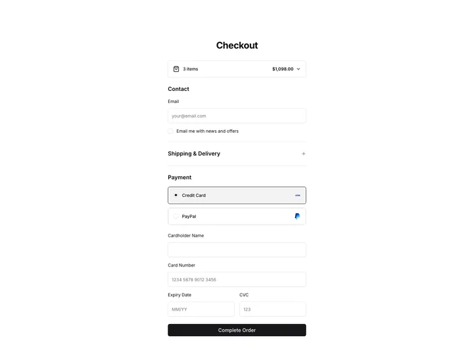
The Checkout3 component presents a comprehensive and interactive checkout interface specifically tailored to enhance the user purchasing experience. Utilizing the Shadcn UI, it effectively organizes the checkout process into distinct sections: Collapsible Cart, Contact Information, Shipping Options, and Payment Details. This component excels in its use of dynamic form handling, allowing real-time updates and validation as users input their information. The design incorporates interactive elements like collapsible sections and radio buttons to streamline the checkout flow, making it intuitive and user-friendly.
Delving deeper, this Shadcn component sets itself apart with its smooth integration of features like dynamic product management and multi-step forms. The Collapsible Cart feature provides a clear overview of the selected items and their associated details, with functions to adjust quantities or remove items effortlessly. The accordion-style Shipping Delivery and Payment sections enhance usability by allowing users to expand and interact with each section separately, maintaining focus on the task at hand. Moreover, its intricate validation system accommodates various payment methods, ensuring a secure transaction process. By effectively leveraging Shadcn UI elements, the component ensures a seamless and customizable checkout experience, distinguished by its adaptable interface and transaction clarity.