Chart Group 3 block design & features
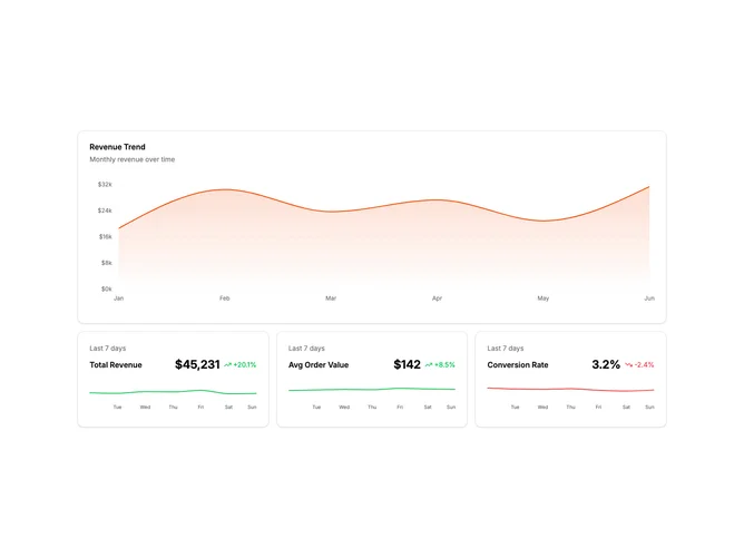
ChartGroup3 presents a multi-scale view of business metrics. The main area chart displays monthly revenue trends (Jan-Jun), while three stat cards below zoom into the last 7 days of related KPIs: Total Revenue, Average Order Value, and Conversion Rate.
Each stat card shows the current value, percentage change, and a sparkline with day-of-week labels. The sparklines use color-coded lines—green for positive trends, red for negative—making it easy to spot which metrics need attention.
This dual time-scale approach helps users understand both the macro trajectory and recent micro-movements. The monthly chart answers "how are we trending?" while the weekly sparklines answer "what happened this week?" Common for executive dashboards where quick decisions require both context and recency.
On mobile, the layout stacks vertically with the main chart on top and stat cards below in a single column.