Chart Card 2 block design & features
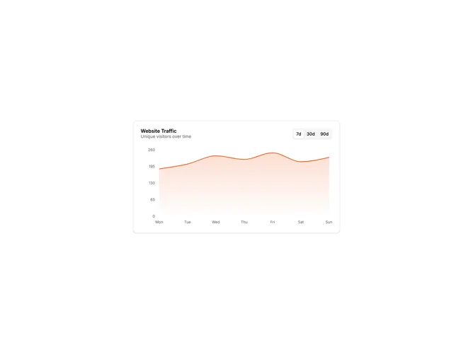
ChartCard2 is an area chart card with a time period selector in the header. The layout places the title and description on the left with a tabs component on the right offering 7d, 30d, and 90d options. The chart updates when switching between periods.
Light card surface with the tabs using shadcn default styling. The header uses flexbox to align title and controls. The chart maintains the same height across all periods for visual consistency. Data labels on the X-axis adjust based on the selected period showing days, weeks, or months as appropriate.
This is a common dashboard pattern where users need to view the same metric across different time ranges. The integrated time selector eliminates the need for external filters. The chart transitions immediately when switching periods. A practical, interactive widget for analytics dashboards.
The tabs component is compact and fits well in the card header without crowding the title. The chart is responsive within the card container.