Chart Card 18 block design & features
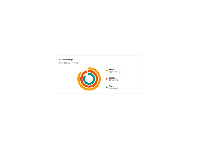
ChartCard18 displays multiple progress metrics as concentric rings, similar to fitness tracker activity displays. Each ring represents a different metric with its own color and progress level. A legend beside the rings shows the label, current value, target, and percentage for each metric.
Light card surface with three nested circular progress rings. Each ring has a muted background track and a colored progress arc with rounded ends. The rings are sized to nest with consistent gaps between them. The outer ring is largest, inner ring smallest. A vertical legend on the right shows colored indicators matching each ring.
This multi-ring format is popularized by fitness apps for tracking move/exercise/stand goals. The concentric layout efficiently displays multiple related metrics in a compact space. Each ring can complete independently, and rings can exceed 100% by overlapping. A visually distinctive pattern that users recognize from health and fitness contexts.
The component accepts an array of ring data for flexibility. Ring colors, values, and labels are all configurable. The SVG-based implementation ensures crisp rendering.