Chart Card 16 block design & features
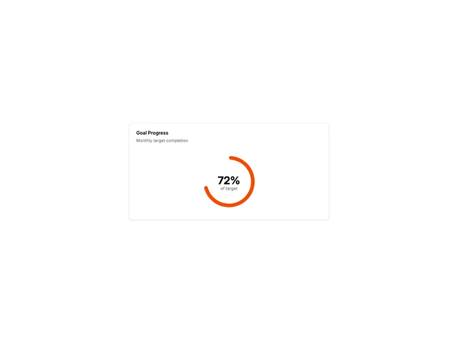
ChartCard16 is a radial progress chart showing completion percentage as a circular ring. The ring fills clockwise from the top, with a muted background track showing the remaining portion. The percentage value displays prominently in the center with a label below.
Light card surface with a thick progress ring using the primary chart color. The background track uses a muted color for contrast. The ring has rounded ends for a polished look. The center displays a large percentage number with smaller descriptive text below. The chart is centered within the card content area.
Radial progress charts are effective for goal tracking, quota completion, or any single metric with a known target. The circular format is visually compact and immediately readable. The centered value eliminates the need to interpret the ring position precisely. A common pattern in dashboards and achievement displays.
The component accepts value and max props for easy customization. The ring animates smoothly when values change.