Chart Card 14 block design & features
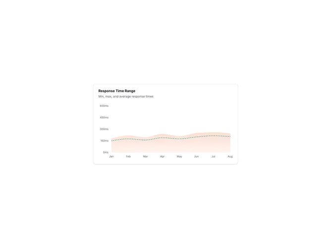
ChartCard14 is a range area chart showing minimum and maximum bounds as a shaded band with an average line overlaid. The band represents the spread of values while the dashed line shows the central tendency. This three-value visualization provides more context than a simple line chart.
Light card surface with a gradient-filled band showing the range. The min/max area uses a subtle fill that fades toward the bottom. A dashed line in a contrasting color shows the average, making it easy to see how the mean relates to the extremes. Horizontal grid lines provide reference.
Range charts are useful for response times, temperature ranges, price fluctuations, or any metric where variability matters as much as the average. The band immediately communicates uncertainty or spread. The dashed average line lets viewers track the typical value while understanding the bounds.
Tooltips show all three values (min, max, average) when hovering. The chart clearly labels units in the axis.