Banner 6 block design & features
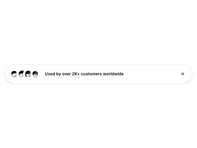
Banner6 is a compact social-proof ribbon built with shadcn/ui Avatar stacking and a ghost dismiss button, floating near the top like Banner5 but shaped as a pill with generous horizontal padding. Overlapping circular avatars sit beside a single emphasized sentence; optional props exist for counts or URLs in the type surface, yet the shipped layout focuses on faces plus copy plus close.
The shell mirrors Banner5’s elevated treatment (border, shadow, centered max width) while the capsule silhouette keeps it lighter than a full-width bar. Avatar rings use a thin outer ring so overlaps stay readable.
Overall tone is friendly proof-led marketing rather than dense messaging; complexity stays moderate because imagery does most of the storytelling.
Dismiss collapses the component entirely; seed visibility through defaultVisible when you need it suppressed on first paint.