Banner 5 block design & features
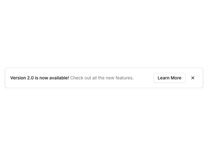
Banner5 is a floating notice built with Shadcn UI buttons and spacing utilities, centered near the top of the viewport inside a max-width shell with horizontal margins. Text stacks on small screens and stretches into a row with actions aligned to the end on wider breakpoints. An outline button opens the configured URL in a new tab while paired ghost icon buttons dismiss the banner.
Visually the panel reads as a raised card: rounded rectangle, light border, soft shadow, and muted secondary copy under the bold title line. Close mirrors Banner4 with mobile-first placement vs desktop inline alignment next to the CTA.
The pattern feels modern and product-like without extra ornament; animation is limited to a simple fade-in on mount for the floating shell.
Because it is absolutely positioned, it overlays page content rather than pushing layout; pairing it with top padding on the page avoids accidental overlap with navigation.