Banner 2 block design & features
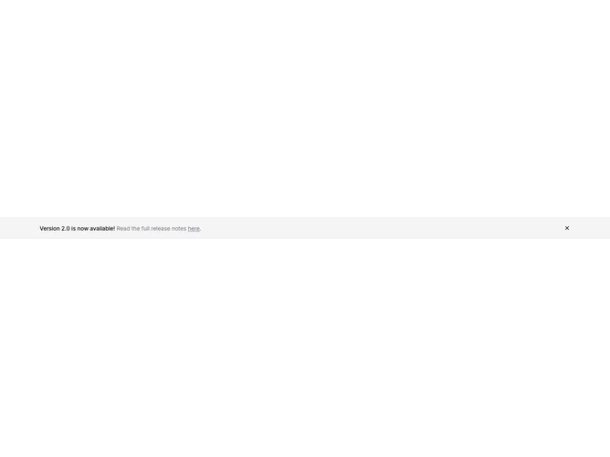
Banner2 is a shadcn/ui banner pattern that mirrors Banner1 copy structure but wraps content in a container and switches the strip to a muted background without the full-width bottom border accent. The inline sentence still pairs a bold title with softer body color for the remainder, embeds the underlined external link, and finishes with a period, while a ghost icon button closes the banner using shadcn/ui button variants.
State matches Banner1: local visibility toggles off on dismiss and the section stops rendering. Props cover the same title, description, link label, URL, and default visibility hook.
Visually this reads slightly softer than a flat background bar because the muted panel floats within max width, which can feel more at home above complex page headers. It remains a small, focused component with minimal layout branching.
Narrow widths may wrap the text block before the close control; the flex row keeps the button adjacent with a slight negative margin utility on the icon slot for optical alignment.