Background Pattern 6 block design & features
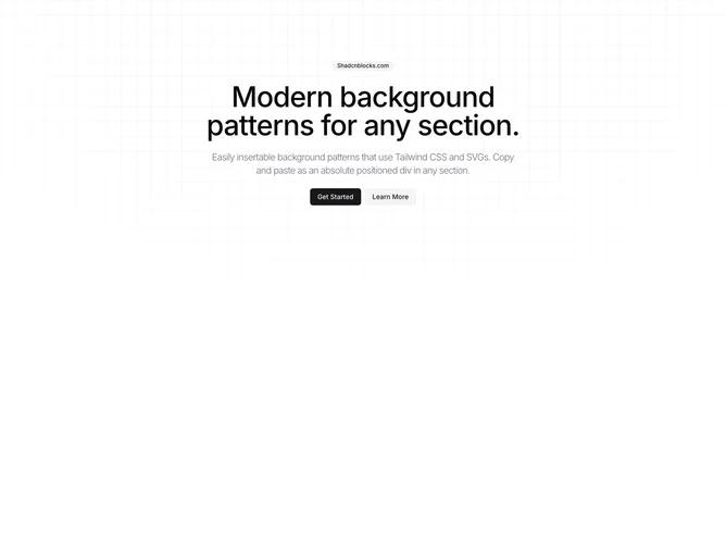
BackgroundPattern6 is a versatile shadcn block designed to enrich sections of your application with an elegant background pattern. It encapsulates visual elements that both complement and enhance existing content, providing a visually arresting background texture by integrating a grid-like pattern. This component elevates the aesthetic appeal of various elements within its space while maintaining the simplicity and cohesion of your design layout.
Delving deeper into its features, BackgroundPattern6 employs a shadcn ui strategy with a unique combination of gradient patterns and innovative masking techniques. The component creates a dynamic fade effect at the top, simulating a sense of depth and focus on the central content area. The linear grid pattern fills the entire section, contributing to a structured yet subtle backdrop without overwhelming the primary content. The flexibility to extend this component through optional class names further allows for seamless integration and customization within different design schemes, making it an invaluable tool for designers looking to add a touch of intricate design to their user interfaces.