Background Pattern 3 block design & features
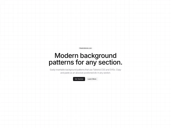
The BackgroundPattern3 component serves as a versatile block for creating visually appealing layouts with a sophisticated grid pattern. This shadcn ui element is designed to be seamlessly integrated into various user interfaces, offering a distinctive background pattern that enhances aesthetics without overwhelming the overall design. Its main function is to provide a consistent and elegant grid-like background, leveraged through CSS gradients, to ensure that it remains both lightweight and highly customizable.
Diving deeper into its structure, the BackgroundPattern3 shadcn component features a minimalistic yet effective design approach. At its core, the component employs a CSS-based grid pattern as the default background, achieved through dual linear gradients which contribute to the pattern’s subtle and muted appearance. This shadcn block also offers a pattern placeholder, allowing additional customization through component nesting. Incorporating flexibility, the component accepts an optional className prop, enabling seamless adjustments to its overall style and adaptation to various design requirements and contexts. This makes BackgroundPattern3 an ideal choice for developers seeking an efficient way to incorporate structured backgrounds in their layout designs.