Background Pattern 2 block design & features
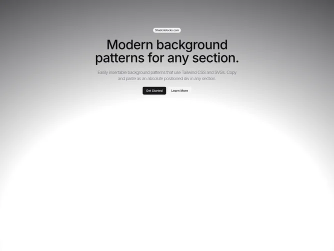
The BackgroundPattern2 component is a shadcn block that renders a visually striking background pattern on a webpage. This component combines a placeholder for pattern elements with an eye-catching radial gradient, offering a unique design that enhances the visual appeal of a user interface. It is ideal for scenarios where a distinctive, layered pattern is required to draw the user's attention or provide a thematic backdrop.
In more detail, the BackgroundPattern2 shadcn ui component seamlessly integrates a pattern placeholder, which allows for further customization or dynamic content insertion. The core of its design is a radial gradient that radiates from the bottom, blending adaptable color variables. The gradient starts at a specified point and makes a transition that attracts focus to the center of the pattern, thereby providing an aesthetic appeal that's both modern and flexible for a variety of applications. The component's capacity to accept a className prop further enhances its utility, enabling developers to easily adjust styling and layout to fit specific design requirements.