Background Pattern 19 block design & features
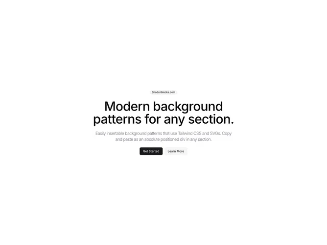
The BackgroundPattern19 component provides a visually engaging section designed to enhance the aesthetic appeal of your user interface. It employs a distinctive dasher grid pattern as a backdrop, effectively transforming a plain background into a highlighted visual element. This shadcn block serves as a foundation for embedding other components or content, making it an ideal choice for creating a standout section within a larger design.
Delving deeper, BackgroundPattern19 utilizes a combination of linear gradients and advanced masking techniques to achieve its signature dashed grid effect. This pattern introduces an intersecting linear dash of muted colors that combine to form an intricate grid. Positioned statically in the background, the shadcn UI element lays the groundwork for enhanced interactivity by overlaying a PatternPlaceholder, allowing for custom content manipulation. The component is engineered to offer flexibility via its className prop, giving developers the freedom to tailor its styling and harmonize it with existing design systems. The focus on unique background design distinguishes this component, catering to those who need more than a mere visual filler.