Address Book 1 block design & features
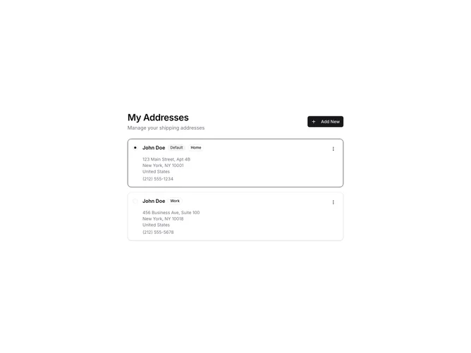
The AddressBook1 component provides a user-friendly interface to manage a collection of addresses, offering functionalities to add, edit, delete, and select addresses. It initializes with default addresses and offers an interactive experience where users can select a default address and modify address details as needed. This component enhances user interactions by allowing users to keep their address list organized and up-to-date effortlessly.
This shadcn block stands out for its robust design and intuitive interface, integrating with a streamlined UI to ensure a seamless user experience. The component features a radio group to select an address, a dropdown menu for editing or deleting addresses, and form fields for detailed address input. The use of badges indicates the type of address and its status as default, providing visual cues that enhance user understanding and interactions. This shadcn ui implementation uniquely combines functionality and design to offer an efficient address management system suitable for various use cases.