Shadcn UI Radio Group Examples
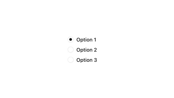
Radio group components allow users to select a single option from a set of mutually exclusive choices. They appear in forms, settings panels, and preference interfaces for single-select options where only one choice is valid.
These blocks show radio groups with labels, helper text, and various styling options. Examples include radio groups with descriptions, radio groups integrated with form layouts, and radio groups with custom styling.
Shadcn radio group examples cover the most common patterns: form radio groups, settings radio groups, and radio groups with descriptive labels. Browse our blocks to find the configuration you need.
