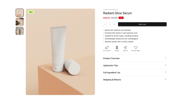
Shadcn UI Product Detail Blocks
A product detail section displays comprehensive product information for a single item. It appears on dedicated product pages, serving as the primary purchase decision interface that provides all information needed to evaluate and buy a product.
Product detail blocks combine product galleries with multiple images, titles and descriptions, pricing displays, variant selectors for size or color, quantity selectors, add to cart buttons, product specifications, reviews and ratings, and related product suggestions. Effective implementations prioritize key purchase information, use clear visual hierarchy, and provide comprehensive product details without overwhelming users.
Shadcn product detail blocks tend to follow a few approaches: the single-column layout with stacked information, the split layout with gallery and details side-by-side, or the tabbed layout for organizing extensive product information. Browse our blocks to find the structure that matches your product complexity and information architecture.
